December 28, 2011

Merry Christmas

Okay, I know. Christmas is now past and New Year's is almost upon us. But I just realized that I never shared my card with you. I (of course) made it in MDS. I love the look of the trifold cards, so I wanted to go with that- also it allowed me to write the letter on the back of the card so that I get it all done in one.

Without further ado, here is the front of the card:


The colors are Very Vanilla, Marina Mist, and Cherry Cobbler; and I used the Serene Snowflakes stamp brush set to create the background. In order to get the squiggly edge I had to make the background once with white on blue and once with blue on white. Then, I exported each option and brought them back in as punches- the squiggle I then created between them using the trim die at an angle.
Then, for my back I wanted to do a letter sort of thing, but the problem is that I never get around to writing a long letter. So, instead I used the cute Christmas countdown set to note our top 10 events of the year. I'm really happy with how these turned out!


Now, it is just a matter of finishing printing them off (opps... I don't procrastinate at all...) and sending out. With any luck people will get them around the new year. At least then mine will stick out in peoples minds, cause the last gets remembered the best right?

Hope you had a great Christmas and wishing you a Happy New Year!

Pin It!

December 23, 2011

Letters to Santa: The Final Installment

All good things must come to an end, and so this album must stop sometime. However, with all the great skill you've learned you could always continue to add more pages to the album if you desire :)

The next two spreads I created using templates that came with the software (either the full software or the booster). They are located in the baby album- it doesn't matter whether you choose the boy or girl, since really the only difference is the colors (which get changed anyway).


Okay, so you better have caught it this time. If you said "Hey look, there's that paper again" then you're right. Best trick ever! Okay, I'll stop now (but I do really love the ability to do that). Making this page was pretty easy. Pretty much it just required switching out the baby stuff and colors for Santa stuff. I'm not personally a huge pink fan- so I will probably change this to a different color before I print it. However, since the blushing bride matches the Letters to Santa collection, I wanted to be sure to feature it in at least one place for those who love pink.

Next, this page was really simple. It doesn't have a lot of parts, so there was very little to swap out. I did add the red squares to the layout (they were not in the original template) because I thought it helped to lessen the busyness of the ornament background and make the page look more classy.


And last but not least, the final page of the album. Once again, this should look familiar- it is a copy of a page we've already seen. Except, here there are more embellishments instead of the smaller pictures.


Well, that wraps up my Letters to Santa album. Thanks for taking this journey with me, and I sincerely hope that you enjoyed the ride. I hope you have a Merry Christmas and a Happy New Year.

(P.S. If you don't hear from me again for awhile it is because I sadly must begin studying again shortly after the new year. I can't wait to be free of these tests. I will try to find some free time to make and post projects this spring, but they may be few and far between until after this next test in May.)

Pin It!

December 20, 2011

Letters to Santa: It just keeps going, and going...

...but that's okay cause it's good stuff!

You're in for a real treat today, cause I think this is one of my favorite layouts. I just love the bright colors in it.


For this layout I combined a copy of page 8 with a copy of page 3. Do you see the resemblance? On the copy of page 8 I made a couple of quick changes- the background paper (hey, look, there it is again...), deleted the upper left picture and replaced it with an embellishment, made the lower left picture taller, and changed the title block to a journaling block.

On the copy of page 3 I removed the middle left and right pictures, added paper to the middle circle picture, and changed the background. Then I dressed up both of the pages with some embellishments and colored the picture frames to match. Once again, a really quick spread in very little time. Gotta love templates!

The next pages is what I envision as the Christmas letter/picutre spot. There really aren't any tricks here (except maybe to borrow the tree from the cover instead of recreating it) and I think that the picture is pretty self explanatory as to how it was all put together. I love the way the "stamp" paper border on the right hand side complements the area for the Christmas letter and just helps to pull the theme all together.


Hope you're having a great weekend. Only five more days until Christmas! Then I'll have pictures to fill up this album. Yippee!

Pin It!

December 15, 2011

Letters to Santa: The Saga Continues

The first page of this following spread should look familiar:


Do you see it? It is actually an altered mirror image of the first page of the album. By swapping out some of the colors, papers, and embellishments we were able to achieve a new page very quickly, and yet have it look different enough to not stand out as a copy in the album. Nice right! Most people's complaint about scrapbooking is that it takes to much time. That is why I designed this album for a class where people learned how to make the best use out of their templates.

On the same note, this next layout should also look similar:


That's right, it is also made from mirror images of the blue/pink two page spread I showed earlier. Once again, with minimal changes and time spent we were able to make a set of pages that looks really wonderful.

By using tricks similar to this throughout the class, the two people I was working with were able to go from my 10 page template to a full 22 page album in a couple hours (sans pictures, which they can put in on their own after the holiday's are done). AND this was the first time one of them had used MDS (the other had only used it on a couple of occasions), so that was pretty quick. Much faster than traditional scrapbooking to be sure.

By the way, did you catch it? On that last layout I once again used the brown and white paper with the opacity turned way down so the espresso background would show through. I told you it would show up again (and we're not done yet so keep your eyes peeled). Best technique ever :)

Pin It!

December 9, 2011

Letters to Santa: Trilogy

And now, part three of the epic series "Letters to Santa". Previously on on this epic voyage...

Before we begin looking at the pages for today, I want to talk to you a little about the Letters to Santa line a little more, and I also want to introduce you to the "favorites" in your color palette. The papers and embellishments from this set were made to match six SU! colors really well: Early Espresso, Marina Mist, Riding Hood Red, Blushing Bride, Old Olive, and Whisper White. Now, if you are anything like me, you know right where most of these colors are in the SU! color palette in MDS (especially Old Olive- that one gets used ALOT!). But, if that isn't you (and even if it is) I've got a quicker way for you to locate these colors as you work on your project. It's the "Favorites" tab.

So, first select a color you want saved in the main color palette (here I selected Whisper White) and then instead of clicking okay, click add to favorites in the lower right hand corner. Notice along the top where it lists "Palette, Swatches, HSB...", the last tab is Favorites and that is what we are customizing.


This will add the color to the favorites tab (Yeah). Below is a screenshot of my favorites tab after I've added the six colors I'm using with the Letters to Santa album. Notice that there is also a button that allows you to remove favorites once you no longer want them anymore. Now you are all set. Anytime you need a color to match the project, you've got it handy at your fingertips in your favorites.


Alright. Now that you are set to quickly pick colors, let's get on with the album. I think that this next layout would be really cute for pictures sledding or building a snowman. I love the soft blue that Marina Mist lends to this product line. Also, I should point out that the large embellishment on the right-hand page is actually a stamp that has been colored in with punches. There are three layers behind it- the bottom most is the pink square, followed by the olive circle, and last but not least the marina square (rectangle) at the top of the ornament. This stamp was really easy to "color" this way because of it's nice smooth lines and basic shapes. But together I think it has a really nice look to it.


My second layout for you today is a good way to pack a lot of pictures into a small space. For your information, the really long looking middle pictures are actually two separate pictures if you visualize where the spine of the album would cut through (it is just hard to show here). I love the little reindeer peeking into the page- isn't he cute :)


And thus concludes part three of this epic series. Tune in next week to hear Santa's judgement "Naughty or Nice".

Pin It!

December 7, 2011

Letters to Santa: Take 2

I know you're just dying to see where the album went next, so let's just jump into the next set of pages.

Have I ever told you before how much I love the black and white papers from "Night and Day"? Okay, so I know that I have, but just to reiterate- they are awesome. By making them less opaque and changing the background color to a solid swatch you can essentially colorize the paper. So cool right! Well, there is a white/brown paper in the Letters to Santa DSP that works much the same way. WooHoo! Here is the first time that I used it (keep your eyes peeled and you'll see it show up again). The opacity is turned down to 10% and the background is Riding Hood Red. It makes a whole new look for the start of the page.


The next page is what I'm envisioning as the "Santa Photo" pages. Wouldn't these be cute for pictures of a kid sitting on Santa's lap whispering into his ear? The reindeer in the lower right corner is highly enlarged- however, since I have the opacity turned down so low it should act more as a watermark on the photo and not get to pixilated. I should also note, on the page above I also enlarged some of the snowflakes. From experience I can say that you can usually safely enlarge stamps some before the effects become noticable. I would not suggest making it any more than twice the original size though if you're keeping the opacity up.


HO HO HOpe you're enjoying the series so far.

Pin It!

December 5, 2011

Letters to Santa

I love the "Letters to Santa" line this year don't you! The papers and embellishments are so fun, and the two matching stamp sets (Winter Post, Merry & Type) are so much fun. It reminds me of an old-fashioned Christmas. So, when my mom and I decided to hold an MDS class for some of her customers these products were an easy choice.
The class was focused on making the most out of a scrapbook templates. So we started with a 10 page scrapbook featuring this product line, and then expanded it to the full 22 pages needed for a printed book. All in the course of an afternoon! Now that's what I call quick.
Over the course of the next couple of posts I'll share the album I designed with you all. I hope it inspires you to make your own book too.

Here is my cute cover. It features the ornament embellishments on the back-cover hanging from really skinny "square" punches filled with espresso. On the front I used the flourish from the Friends 24-7 turned upside down to make my tree (I know, it isn't from the Letters to Santa line, but it is so perfect for a tree).


Then comes the first page/title page of the album. The blue area is actually cardstock dragged into a photobox. This allows for easy switching of the layout- just delete the stamp and blue inside, and add a picture instead. Also, the bottom can either be filled with journaling or a large title.


Stay tuned for more pages to come!

Pin It!

November 12, 2011

Contest Page Instructions

I've gotten many comments on my contest page, so I wanted to be sure to put together a step-by-step instructions for those of you who wanted to recreate the look.


 First I started by creating the background paper. For this I used Autumn Spice digital pack- the stripped paper and the french foliage stamps. With all the stamps on this page the program was already slowing up a bit, so I exported the page allowing me to use the background as a single DSP in further steps, making thing much faster.


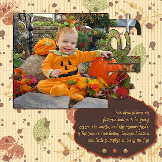
Next I added my pictures and journaling. In order to get the pictures into the punch shapes (simple letters punch and the pumpkin punch from the Grateful Heart Thanksgiving Ensemble) I started by filling them with DSP. Then, if you click on the punch there is an option in the bottom left hand corner there is a button to "Replace image". Using this you can then navigate to your picture and fill the punch with the picture instead. I also made sure "Rotate image with punch" was unchecked, since I wanted it to stay in the correct direction. Then it was just a matter of zooming out and moving the picture around until I matched it up with the surrounding picture pieces.
The other pieces I used on this page were the glimmer brads and the Lots of Tags Shape 3 punch for the journaling block. The font used is from the Creating Keepsakes website and is called "Ali's Hand". It is pretty much my go to font for all journaling that I want to look handwritten.
After all this was done I exported my page- For future reference I will call this the BASE IMAGE.


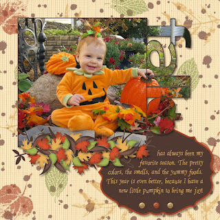
For the next step I started with the base image set as the background paper, and then I put the tree image from the Bold Branches stamp brush set on top of it. I also added a white drop shadow to help the branches pop a little. I then exported this page- it will be referred to as TREE IMAGE.


Now, I once again started with the base image as the background paper and I added the two punches as shown above. I then filled the white punch with the tree image and the purple punch with the base image. This allowed me to cut out the branches that I didn't want, and only keep those in the location that I did want, giving this final result:


Once again I then exported the page to be used later as a background.


Next I moved on to creating the leaves. The leaves are from the Autumn Traditions digital kit. I punched out the leaves in the base color I wanted them. Next, I put a slightly smaller version of the punch on top of each leaf and filled with DSP. I then double clicked on it so that I could drag the DSP off the image, allowing me to add a drop shadow to the punch with no actual image in it. This created the lighter center of each leaf. Finally, using the textured stamp (shrunk WAY down) I added the darker shading to the edges of the images. Then, you guessed it, I exported the page which I will refer to as the LEAF IMAGE.


Last but not least, was adding all the little leaves on top of the sticks to make it look like a fall pile. I started with the base image as the background, then added small versions of all four leaf punches. I filled each of these with the picture of the leaf image (zoomed out and centered over each leaf area). I kept a version of each of these four punches along the side of my paper so that I could just make a copy of it and rotate it as needed when I put it on the leaf pile, that way I didn't have to go through the process of punching the leaf every time.

And there you have it. My many hour page! Although I can't spend this much time on all my scrapbooking (or I would get nothing done) I'm glad I was able to do it for this page because I love the finished effect. A perfect page for a perfect picture- which by the way also took an hour to get because the little stinker was so absorbed in looking at all the props around her that I couldn't get her to look at the camera and smile. About the time I was ready to give up we finally got this little jewel :)

Pin It!

October 31, 2011

MDS Contest

They announced the finalists on mydigitalstudio.net today- so sad I'm not amongst them again this year. I thought I had a really good shot too! My submissions each took a couple of hours to put together (and I normally do not spend that many hours on a page or a card). Oh well.
However, since I am still very proud of my works of art I'm gonna show them of to all of you lovely folks :)  First, I made a fall themed scrapbook page with my little pumpkin. Note the punched out pictures that line up along the right side- cool right?!


Then my second submission was a wedding day card. I was trying to recreate the look of a wrapped bouquet- do you like what I came up with? This has so many pieces in it- each flower is comprised of six different part, and that's not even counting the rest of card.


Both of these projects forced me to complete part of the project, export it, and then bring it back in through a punch (or multiple punches). In the card I did this to create the wrapped look of the stem, and in the scrapbook page I used this technique to create the pile of leaves and sticks. I'll post the step by step instructions later.
Hope you enjoyed my creations as much as I did!

Pin It!

October 20, 2011

Swatchbook

So it's not later yet (I still have a ton of studying to do) but this idea has been brewing for days now and I had to get it out so I could concentrate on my studies better. I'm going to print a swatchbook with the same page repeated over and over, and then take it apart to make Christmas ornaments to hang on the gifts I give away this year! Cool idea right? And the ornaments will come to only a little over a buck a piece once I embellish them a little.


Well, here's the design I cam up with. It's by no means final yet, but I'm really liking the style so far. Isn't it adorable! In order to create this I made the front of the ornament on the "back" of the swatchbook page, that way the hole punch will be in the upper left hand corner. Then the front of the page is my basic ornament back. I plan to embellish it with some of SU adhesive pearls over the placeholders I have now. Then I'll hang it on one of the fancy lace ribbons, and Wa-La, a beautiful antique style homemade ornament. Hopefully all my friends and family will love it!

Pin It!

October 16, 2011

Later

I just wanted to apologize for my lack of posts as of late, and to say that it will continue for awhile yet. I am currently studying for an actuarial exam, which is killer hard, so I have no free time to scrapbook or make cards. But there is a light at the end of the tunnel- the test is three weeks away and then I get the holiday's off of studying. So check back in November for some new spiffy projects, and to see what I come up with to document my recent vacation!

Pin It!

April 14, 2011

Can you believe it... CARDS

I know, for a paper-crafting blog I show very little projects actually MADE with paper (as opposed to printed on it). It all has to do with the accessibility of my stamps (piled helter-skelter in the closet), where I have time to work on something other than raising an infant and taking care of the house (on the bus), and where my current interests lie (that one is obvious...).

However, this weekend I helped my mom out with a workshop/class/display that she was invited to. I was the "MDS teacher" who told everyone about My Digital Studio and the great things that it could do. In return, I got to make a set of cards from my mom's class for free! So I actually got to touch a stamp to paper for the first time in a LONG LONG time :)

Well, since I don't make much of my own in the way of paper projects, I thought that I just had to share these real, physical, crafts with you. I picked two of the three cards to share. The first is my favorite- it is so nice and bright, making me feel like spring.


The next one is just nice and simple, yet really elegant. This one is obviously themed for a wedding, but you could easily switch out the stamped sentiment for a different one and still keep the same effect. I love the rhinestones especially. Gives it that extra shine :)


Pin It!

April 13, 2011

Graduation

With Graduation season coming up I thought I should feature an invite to an open house that I had designed. This will be for my husband's graduation from his master's program this spring- it is just waiting on a nice picture of him (which I plan to take at Easter when he is all spiffied up) and a "join us" type message.


In the meantime, I have a placeholder picture put in so that I can see what it will look like finished.

Note the nice dark area at the bottom, perfect for the "invitation" portion of the card. This was done with my (favorite) Night and Day paper, with the opacity turned WAY down and black background filler. I also put a little tab in the top right corner which is perfect for a school emblem.

But the best part of all is the ability to put a picture inside a punch. How do you do that you ask? Well, I ran across this technique on mydigitalstudio.net. You place your punch on the page and fill it with DSP- it doesn't matter which one, cause you're not going to keep it anyway. Now, double click on the punched image to bring up the window where you can move the DSP around. In the lower left hand corner is a "replace" button. If you click this you can navigate to any picture on your computer and choose it as the punch filler! I hope that in the future MDS comes out with an update that makes this process easier... but in the meantime you can still enjoy the benefits of punching out a picture with this process!

Hope you enjoy, and don't forget to create your own invites soon!

Pin It!

March 31, 2011

Hey Look, More Butterflies

Whew. Working and being a mom sure takes a lot of time. My fingers have been itching to do some scrapbooking lately. Especially with some of the new downloads I’ve gotten recently! Not to mention I am SO behind on my daughter’s album… and she is only four months old.

So, I finally started taking my laptop on the bus with me. Not the perfect place to work on MDS if it gets crowded, but, hey, one of the major benefits of digital scrapbooking is that you CAN take it with you reasonably. And it gives me the option to something interesting on my daily commute.

Well, I wanted to make sure that I hit on the important events first in my “catch-up” project, so what is more important than my daughter’s christening. Not really much at this point I suppose, so that is where I started. Besides, I love some of the pictures we took that day. She looks like a little porcelain dolly.


I’ve got a couple of tricks for you on this page that I’m really proud of. First off- I’m loving the Nursery DSP inside punches. Check out the cool design on the butterfly punches. This was achieved by putting the frilly pink circle DSP inside the punch and zooming way out. Then, I placed a punch of plain cherry cobbler paper behind it. Finally, I topped it off with the butterfly stamp from the new set Cottage Garden with a white centered shadow (you know how I love my shadows). The finished product is so dainty I just want to squeal in delight!

The other cool trick I used here was to make a custom sized tulip border on the right hand page. To create this look I used the Vintage Overlay twice, overlapping each other just enough to create the desired size box to fit my two photos. Then, disguised the “extra” pieces of the stamp by covering them up with strategically placed squares of DSP that matched my background. The final step was to cover up the goofy looking intersection of the stamps in the lower left hand corner with a strategically placed butterfly embellishment. All together, you would never know that the tulip bordered was pieced together.

Well, that’s all for today. Hopefully it won’t take me quite so long to make my next page now that I’m back into the grove of things again. Can you say “Messy Baby” (think first meal of sweet potatoes- YUM).

Pin It!

January 30, 2011

People

As you finish up your holiday documentation don't forget to highlight the important people in your life. Sometimes we get so caught up in remembering the activities that we forget to remember the people. So, this is the last of my Christmas pages (although it is not really all that Christmasy besides the tree behind us in the background of the picture) in honor of the important people in my life that came to join us for the special day.


I realize the layout is pretty simple and there aren't a lot of embellishments. But I like how classy it turned out anyways. The only tip I can give from this page is this: sometimes you have to use multiple text boxes to achieve the look you want. I actually used five different boxes here. I had to split the "Starts & Ends" into two different boxes because the spacing on the font had them spread really far apart. I kept decreasing the space, but MDS will only let you go to -3.0 and this still wasn't as close as I wanted the lines to be together. So I split them up and kept them both at the same angle to retain the appearance of one text block.

Pin It!

January 29, 2011

Oh Christmas Tree

Here's a fun layout for you to try as you finish up your Christmas scrapbooking.


It's a Christmas Tree! If you want a narrower tree, or a more gradually sloping tree you could play with the size of the photos- but overall you get the idea. Just be sure to add some fun embellishments like a trunk and a star to finish off the look.

I used the fun new Jolly Holiday DSP for this page and then "distressed" the edge of my layout with the textured stamp. Add some journalling and some embellishments, and then the page is complete!

Pin It!

January 22, 2011

The Silent Night

I just love candlelit Christmas Eve services! They have such a calming vibe- what better way to remember the birth of our Savior. Here is a snapshot of how our Christmas started this year.


There aren't really any new tricks on this page- just a few tips I guess. If you are like me and like to have two page spreads in your scrapbook, then I highly suggest making sure that you tie the two together using common elements. For instance, I like to stick with a common color theme and make sure that the colors appear on both pages. Here I used cherry cobbler, artichoke, and vanilla. I picked up the cherry color in the first page with the middle photomat on the second page- this along with the circle shape help to draw your attention and highlight this important picture on the second page.

I also used the common elements of the rick-rack on both pages. I didn't go overboard with it and add it to all the photo edges- but instead just picked a couple of choice locations where it would have the most impact.

Finally I sprinkled the entire layout with the serene snowflake stamps. This really helped to add interest to the pages with very little work.

Well, I guess I do have one technique to share as well. Did you know that your entire text block does not need to be the same font? In the "O Holy Night" of the title I used an alternate font on the capital letters by highlighting them while in the text editing mode and changing the font. I really liked the star font- but found that it was just to much to do the entire title in it, so this was my solution.

Now here's a challenge- Have you finished scrapbooking your Christmas yet? If not, I hope this festive page gets you in the spirit (again) and you start to archive your holiday memories from this year.

Pin It!

January 15, 2011

Giving Thanks for my 'Lil Turkey

Thanksgiving- that great American holiday where we all stuff ourselves silly and surround ourselves with family :)

This year my family had one more join us- only a week old! We (especially me) were all awfully glad she decided to come in time for Thanksgiving. So, here is my page in honor of the special holiday.


Do you like how the Gratitude quote looks like it is glowing? I created this appearance by adding a drop shadow- centered on the stamp- in the vanilla color with the opacity turned all the way up and a good blur selected. Then I copied and pasted the stamp back on top of itself a couple of times to increase the shadow even more. I was pretty happy with the final look (the stamp alone barely showed up on the busy paper originally).

Here's another idea. The acorns in the title are all the same stamp- just resized and given different colors and angles. Now that's something you can't do with a real stamp!

Last, but not least, I made the flower behind the picture in the lower right hand corner two-toned. I started with the stamp in just espresso, then I added a shadow. The trick was to make the shadow very opaque, centered on the stamp (no offset), and the blur turned WAY down.

Until another day, ENJOY!

Pin It!

January 12, 2011

2011 Calendar

I created this calendar for my daughter's grandparents for Christmas. As you may notice, it is missing pictures! You may think that seems strange, but there is a method to my madness. The problem with creating a calendar before the year starts is that by the time the months come around the pictures are all out of date. By leaving openings I can send them current pictures as the year goes on so that they can watch her grow up!


There is another master plan to this calendar. If you look closely, each top page of the calendar has an 8x8 square set into it. This will allow the grandparents to cut out this area and save it in a scrapbook- so by the end of the year they will have a complete album to remember her milestones!

I had these printed up through the Stampin Up print services and I am so excited with how it turned out. I have already printed pictures and placed in the January page so that they are ready to send out. One thing I of course didn't think of though- the holes they put in the calendar to hang it up by. Sadly these are located right in the 8x8 layout portion of the page. I can't move this down any farther (since the stripe at the bottom is where the spiral binding is located) so if I create these calendars again next year I would probably plan a 7.5x7.5 square with the idea that it would be backed with a piece of cardstock after it is cut out.

Hope you enjoyed this idea!

Pin It!

January 11, 2011

Busy, Busy, Busy

It has been a busy couple of months in the Swift household. What with getting ready for the baby, being put on bedrest then induced, and then taking care of my sweet little baby girl. It didn't leave me much time to do any crafts the past couple of months- in fact this blog pretty much leaves off at my last project of the DC album (which still remains unfinished- hopefully I will complete it before I forget all about the trip- EKK!).

Lately though my DD has been going through what I can only guess is a growth spurt, and therefore sleeping ALOT during the day, leaving me sometime to get a couple of scrapbook pages done. So I have some new material to share with you :)


The layout for this page is not my own, but was inspired by a post on Splitcoaststampers by MkMiracleMakers. Just wanted to make sure I gave credit where credit was due :)

I've got two tricks for you that I used on this page. First, the striped rust color paper was to stark for me- I wanted softer stripes so that the colors were closer together. In order to achieve this I filled two rectangular punches- one with the Cajan Craze color fill and the other with the matching striped paper. I layered the striped paper over the solid color and then decreased the opacity of it in order to let more of the lower layer show through, thus decreasing the vividness of the stripes. I love the softer look it produced and the darker overall color.

My second trick was "coloring in" the flower in the lower right hand corner. The stamped flower just didn't look right on the DSP- it was much to hard to see. So I "colored" it by placing punched shapes behind the stamp to fill in the area. For this particular stamp I found that a carefully sized oval fit nicely behind each of the petals, and then a circle covered what was remaining in the middle. Then I added some pizzaz by placing a punched flower (with a border) on top in a contrasting color and finished it off with a coordinating flower brad!

Hope you like how this page turned out. By the way, the font is my new favorite "Ali's Hand" which is a free download from the CreatingKeepsakes webpage. If you like to have a good library of fonts to pick from you should visit them often- they have a free font friday download! Some of the christmas fonts recently were pretty cute- the one even looked like candycanes!

Pin It!