December 28, 2011

Merry Christmas

Okay, I know. Christmas is now past and New Year's is almost upon us. But I just realized that I never shared my card with you. I (of course) made it in MDS. I love the look of the trifold cards, so I wanted to go with that- also it allowed me to write the letter on the back of the card so that I get it all done in one.

Without further ado, here is the front of the card:


The colors are Very Vanilla, Marina Mist, and Cherry Cobbler; and I used the Serene Snowflakes stamp brush set to create the background. In order to get the squiggly edge I had to make the background once with white on blue and once with blue on white. Then, I exported each option and brought them back in as punches- the squiggle I then created between them using the trim die at an angle.
Then, for my back I wanted to do a letter sort of thing, but the problem is that I never get around to writing a long letter. So, instead I used the cute Christmas countdown set to note our top 10 events of the year. I'm really happy with how these turned out!


Now, it is just a matter of finishing printing them off (opps... I don't procrastinate at all...) and sending out. With any luck people will get them around the new year. At least then mine will stick out in peoples minds, cause the last gets remembered the best right?

Hope you had a great Christmas and wishing you a Happy New Year!

Pin It!

December 23, 2011

Letters to Santa: The Final Installment

All good things must come to an end, and so this album must stop sometime. However, with all the great skill you've learned you could always continue to add more pages to the album if you desire :)

The next two spreads I created using templates that came with the software (either the full software or the booster). They are located in the baby album- it doesn't matter whether you choose the boy or girl, since really the only difference is the colors (which get changed anyway).


Okay, so you better have caught it this time. If you said "Hey look, there's that paper again" then you're right. Best trick ever! Okay, I'll stop now (but I do really love the ability to do that). Making this page was pretty easy. Pretty much it just required switching out the baby stuff and colors for Santa stuff. I'm not personally a huge pink fan- so I will probably change this to a different color before I print it. However, since the blushing bride matches the Letters to Santa collection, I wanted to be sure to feature it in at least one place for those who love pink.

Next, this page was really simple. It doesn't have a lot of parts, so there was very little to swap out. I did add the red squares to the layout (they were not in the original template) because I thought it helped to lessen the busyness of the ornament background and make the page look more classy.


And last but not least, the final page of the album. Once again, this should look familiar- it is a copy of a page we've already seen. Except, here there are more embellishments instead of the smaller pictures.


Well, that wraps up my Letters to Santa album. Thanks for taking this journey with me, and I sincerely hope that you enjoyed the ride. I hope you have a Merry Christmas and a Happy New Year.

(P.S. If you don't hear from me again for awhile it is because I sadly must begin studying again shortly after the new year. I can't wait to be free of these tests. I will try to find some free time to make and post projects this spring, but they may be few and far between until after this next test in May.)

Pin It!

December 20, 2011

Letters to Santa: It just keeps going, and going...

...but that's okay cause it's good stuff!

You're in for a real treat today, cause I think this is one of my favorite layouts. I just love the bright colors in it.


For this layout I combined a copy of page 8 with a copy of page 3. Do you see the resemblance? On the copy of page 8 I made a couple of quick changes- the background paper (hey, look, there it is again...), deleted the upper left picture and replaced it with an embellishment, made the lower left picture taller, and changed the title block to a journaling block.

On the copy of page 3 I removed the middle left and right pictures, added paper to the middle circle picture, and changed the background. Then I dressed up both of the pages with some embellishments and colored the picture frames to match. Once again, a really quick spread in very little time. Gotta love templates!

The next pages is what I envision as the Christmas letter/picutre spot. There really aren't any tricks here (except maybe to borrow the tree from the cover instead of recreating it) and I think that the picture is pretty self explanatory as to how it was all put together. I love the way the "stamp" paper border on the right hand side complements the area for the Christmas letter and just helps to pull the theme all together.


Hope you're having a great weekend. Only five more days until Christmas! Then I'll have pictures to fill up this album. Yippee!

Pin It!

December 15, 2011

Letters to Santa: The Saga Continues

The first page of this following spread should look familiar:


Do you see it? It is actually an altered mirror image of the first page of the album. By swapping out some of the colors, papers, and embellishments we were able to achieve a new page very quickly, and yet have it look different enough to not stand out as a copy in the album. Nice right! Most people's complaint about scrapbooking is that it takes to much time. That is why I designed this album for a class where people learned how to make the best use out of their templates.

On the same note, this next layout should also look similar:


That's right, it is also made from mirror images of the blue/pink two page spread I showed earlier. Once again, with minimal changes and time spent we were able to make a set of pages that looks really wonderful.

By using tricks similar to this throughout the class, the two people I was working with were able to go from my 10 page template to a full 22 page album in a couple hours (sans pictures, which they can put in on their own after the holiday's are done). AND this was the first time one of them had used MDS (the other had only used it on a couple of occasions), so that was pretty quick. Much faster than traditional scrapbooking to be sure.

By the way, did you catch it? On that last layout I once again used the brown and white paper with the opacity turned way down so the espresso background would show through. I told you it would show up again (and we're not done yet so keep your eyes peeled). Best technique ever :)

Pin It!

December 9, 2011

Letters to Santa: Trilogy

And now, part three of the epic series "Letters to Santa". Previously on on this epic voyage...

Before we begin looking at the pages for today, I want to talk to you a little about the Letters to Santa line a little more, and I also want to introduce you to the "favorites" in your color palette. The papers and embellishments from this set were made to match six SU! colors really well: Early Espresso, Marina Mist, Riding Hood Red, Blushing Bride, Old Olive, and Whisper White. Now, if you are anything like me, you know right where most of these colors are in the SU! color palette in MDS (especially Old Olive- that one gets used ALOT!). But, if that isn't you (and even if it is) I've got a quicker way for you to locate these colors as you work on your project. It's the "Favorites" tab.

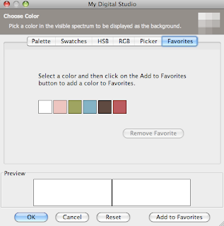
So, first select a color you want saved in the main color palette (here I selected Whisper White) and then instead of clicking okay, click add to favorites in the lower right hand corner. Notice along the top where it lists "Palette, Swatches, HSB...", the last tab is Favorites and that is what we are customizing.


This will add the color to the favorites tab (Yeah). Below is a screenshot of my favorites tab after I've added the six colors I'm using with the Letters to Santa album. Notice that there is also a button that allows you to remove favorites once you no longer want them anymore. Now you are all set. Anytime you need a color to match the project, you've got it handy at your fingertips in your favorites.


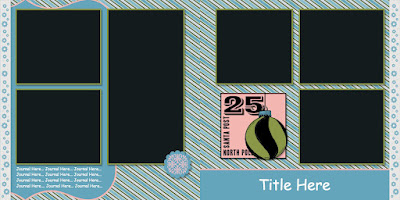
Alright. Now that you are set to quickly pick colors, let's get on with the album. I think that this next layout would be really cute for pictures sledding or building a snowman. I love the soft blue that Marina Mist lends to this product line. Also, I should point out that the large embellishment on the right-hand page is actually a stamp that has been colored in with punches. There are three layers behind it- the bottom most is the pink square, followed by the olive circle, and last but not least the marina square (rectangle) at the top of the ornament. This stamp was really easy to "color" this way because of it's nice smooth lines and basic shapes. But together I think it has a really nice look to it.


My second layout for you today is a good way to pack a lot of pictures into a small space. For your information, the really long looking middle pictures are actually two separate pictures if you visualize where the spine of the album would cut through (it is just hard to show here). I love the little reindeer peeking into the page- isn't he cute :)


And thus concludes part three of this epic series. Tune in next week to hear Santa's judgement "Naughty or Nice".

Pin It!

December 7, 2011

Letters to Santa: Take 2

I know you're just dying to see where the album went next, so let's just jump into the next set of pages.

Have I ever told you before how much I love the black and white papers from "Night and Day"? Okay, so I know that I have, but just to reiterate- they are awesome. By making them less opaque and changing the background color to a solid swatch you can essentially colorize the paper. So cool right! Well, there is a white/brown paper in the Letters to Santa DSP that works much the same way. WooHoo! Here is the first time that I used it (keep your eyes peeled and you'll see it show up again). The opacity is turned down to 10% and the background is Riding Hood Red. It makes a whole new look for the start of the page.


The next page is what I'm envisioning as the "Santa Photo" pages. Wouldn't these be cute for pictures of a kid sitting on Santa's lap whispering into his ear? The reindeer in the lower right corner is highly enlarged- however, since I have the opacity turned down so low it should act more as a watermark on the photo and not get to pixilated. I should also note, on the page above I also enlarged some of the snowflakes. From experience I can say that you can usually safely enlarge stamps some before the effects become noticable. I would not suggest making it any more than twice the original size though if you're keeping the opacity up.


HO HO HOpe you're enjoying the series so far.

Pin It!

December 5, 2011

Letters to Santa

I love the "Letters to Santa" line this year don't you! The papers and embellishments are so fun, and the two matching stamp sets (Winter Post, Merry & Type) are so much fun. It reminds me of an old-fashioned Christmas. So, when my mom and I decided to hold an MDS class for some of her customers these products were an easy choice.
The class was focused on making the most out of a scrapbook templates. So we started with a 10 page scrapbook featuring this product line, and then expanded it to the full 22 pages needed for a printed book. All in the course of an afternoon! Now that's what I call quick.
Over the course of the next couple of posts I'll share the album I designed with you all. I hope it inspires you to make your own book too.

Here is my cute cover. It features the ornament embellishments on the back-cover hanging from really skinny "square" punches filled with espresso. On the front I used the flourish from the Friends 24-7 turned upside down to make my tree (I know, it isn't from the Letters to Santa line, but it is so perfect for a tree).


Then comes the first page/title page of the album. The blue area is actually cardstock dragged into a photobox. This allows for easy switching of the layout- just delete the stamp and blue inside, and add a picture instead. Also, the bottom can either be filled with journaling or a large title.


Stay tuned for more pages to come!

Pin It!