And now, part three of the epic series "Letters to Santa". Previously on on this epic voyage...
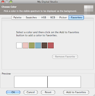
Before we begin looking at the pages for today, I want to talk to you a little about the Letters to Santa line a little more, and I also want to introduce you to the "favorites" in your color palette. The papers and embellishments from this set were made to match six SU! colors really well: Early Espresso, Marina Mist, Riding Hood Red, Blushing Bride, Old Olive, and Whisper White. Now, if you are anything like me, you know right where most of these colors are in the SU! color palette in MDS (especially Old Olive- that one gets used ALOT!). But, if that isn't you (and even if it is) I've got a quicker way for you to locate these colors as you work on your project. It's the "Favorites" tab.
So, first select a color you want saved in the main color palette (here I selected Whisper White) and then instead of clicking okay, click add to favorites in the lower right hand corner. Notice along the top where it lists "Palette, Swatches, HSB...", the last tab is Favorites and that is what we are customizing.
This will add the color to the favorites tab (Yeah). Below is a screenshot of my favorites tab after I've added the six colors I'm using with the Letters to Santa album. Notice that there is also a button that allows you to remove favorites once you no longer want them anymore. Now you are all set. Anytime you need a color to match the project, you've got it handy at your fingertips in your favorites.
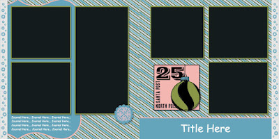
Alright. Now that you are set to quickly pick colors, let's get on with the album. I think that this next layout would be really cute for pictures sledding or building a snowman. I love the soft blue that Marina Mist lends to this product line. Also, I should point out that the large embellishment on the right-hand page is actually a stamp that has been colored in with punches. There are three layers behind it- the bottom most is the pink square, followed by the olive circle, and last but not least the marina square (rectangle) at the top of the ornament. This stamp was really easy to "color" this way because of it's nice smooth lines and basic shapes. But together I think it has a really nice look to it.
My second layout for you today is a good way to pack a lot of pictures into a small space. For your information, the really long looking middle pictures are actually two separate pictures if you visualize where the spine of the album would cut through (it is just hard to show here). I love the little reindeer peeking into the page- isn't he cute :)
And thus concludes part three of this epic series. Tune in next week to hear Santa's judgement "Naughty or Nice".


No comments:
Post a Comment